overview
When someone asks for help, finding the right service shouldn't become another problem.
Citizens Advice supports people navigating complex, often urgent situations through a network of around 30,000 staff and volunteers. I led the research and design of Local Service Search, the mobile and desktop experience used to find relevant services for the people they were supporting.
The challenge wasn't giving people access to more information. It was helping them reach the right information with confidence.
The problem
Service information came from different places, followed different structures and depended heavily on location.
Users needed to understand:
what support existed locally
which organisation provided it
whether it was relevant to the person in front of them
how to find it quickly
At the same time, the people using the service had very different levels of digital confidence. The result was a product that technically contained answers but often made those answers unnecessarily difficult to reach.
product idea
We didn't want to impose a new information model. We wanted to understand theirs.
We ran participatory design workshops with Citizens Advice stakeholders, using the pain points we had identified as prompts for collaborative design. Participants worked in groups with modular wireframe building blocks, reorganising the experience around how they expected information to behave.
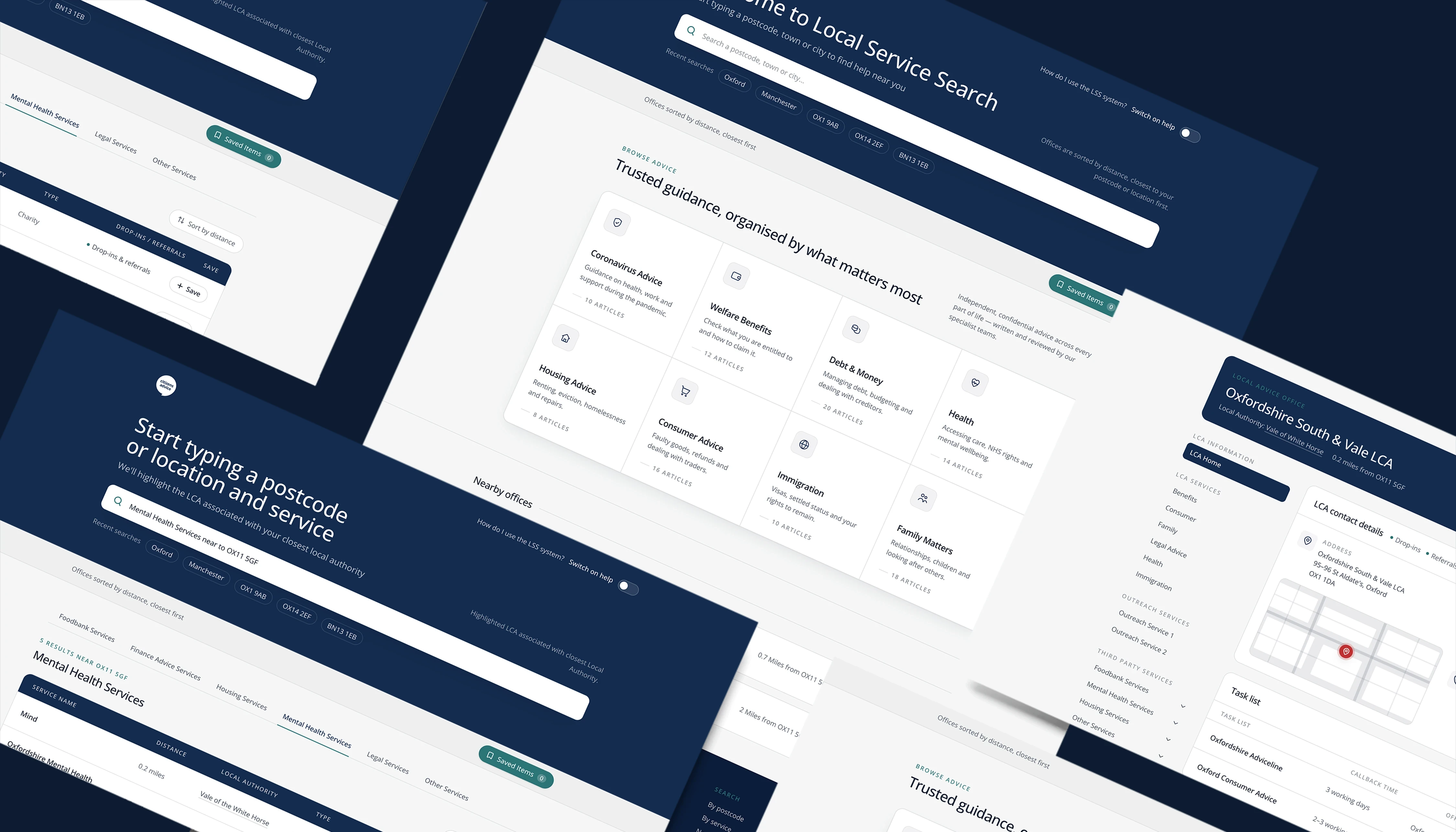
The final product
One search. Three sources of support.
A service could come from:
Local authorities
Citizens Advice
Third parties
Originally, that complexity leaked into the user experience. Instead of pretending those differences didn't exist, we created a clearer structure around them. Users could move between different sources of information without losing sight of the problem they were trying to solve. More structure underneath. Less complexity on the surface.

Keep the place fixed. Let the information change around it.
Because available services depended heavily on geography, we pinned location as persistent context at the top of the experience.
Once a location was established, users could move between Citizens Advice, local authority and third-party information without repeatedly rebuilding the same context. This behaviour emerged directly from the participatory design work.
That turned location from another search field into part of the product's mental model.

Product impact
30% → 90%+ regular adoption
Before the redesign, fewer than 30% of staff and volunteers regularly used the system. Afterwards, more than 90% incorporated it into their regular workflow. That's not just better usability. That's a change in behaviour.
80+ NPS
Adoption was matched by a major improvement in user sentiment, with the redesigned experience reaching an NPS above 80. People weren't only able to use it. They trusted it enough to make it part of their work.
3× increase in regular usage
The redesign more than tripled regular usage. The experience moved from something many people avoided to something frontline teams actively relied on.
What I learned
Designing for different levels of confidence.
Complexity doesn't disappear. It changes ownership.
The solution was structurally more sophisticated than the product it replaced. That was fine. The important thing was that the additional complexity lived in the system rather than in the user's head.
Mental models are product architecture.
Participatory design wasn't simply a research exercise. It directly changed how we structured information and navigation.
Adoption is stronger evidence than preference.
The clearest signal wasn't that users said the redesign was better. It was that regular usage moved from below 30% to above 90%.
Public-service products need to design for confidence.
When digital experience varies widely across users, predictability and clarity aren't cosmetic qualities. They're part of accessibility.